When a badge becomes a shared identity
Start with how people say “I belong”
A community badge often starts with an ordinary problem: people need a small, visible way to say “I am part of this.” A volunteer team, school group or local club may already have a symbol, but the symbol on a screen does not behave like an object someone can wear, collect or pass to a new member.
Give the silhouette a job
The design becomes stronger when the silhouette has a job. A shield can suggest trust, a route can suggest movement, and a circular frame can make a series feel collectible. The centre should carry the recognition cue; the edge can hold a year, chapter or small distinction without turning the badge into a crowded signboard.
Colour and finish set the social tone
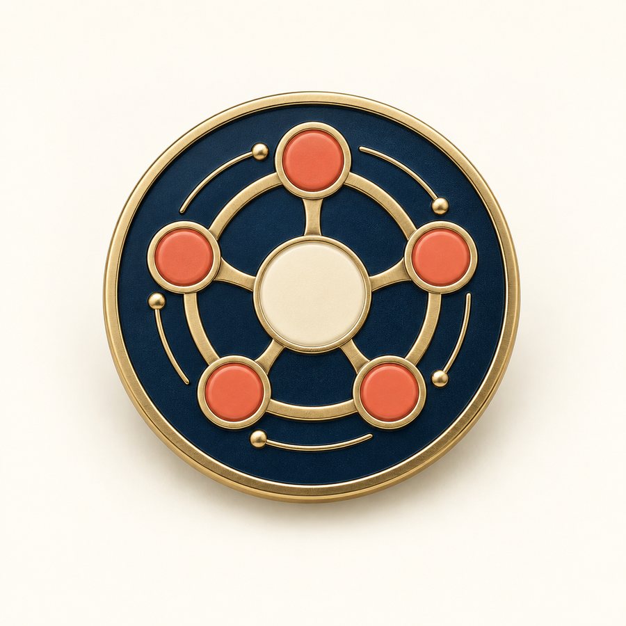
Color and finish also set the social tone. A restrained navy and brass palette can feel established and ceremonial. Softer enamel colors can feel more open and energetic. If a program will issue several badges, use one shared border or backing system so the set feels related while each badge still has its own story.
The final test: recognisable and worth keeping
The final test is not whether the badge looks impressive in a large mockup. It is whether a member can identify it from a distance, whether a new person understands what it represents, and whether the object still feels worth keeping after the event is over. That is where identity becomes belonging.
In short
The strongest badges do more than display a logo. They help people recognize who belongs, what they value and which moment brought them together.